Share

Colors and emotions have a tight bond. Colors, the light waves of various lengths, impact us, even with our eyes shut.
Research reveals colors go beyond aesthetics; they affect mood, energy levels, sleep patterns, and even blood pressure. Some hues boost memory, uplift, motivate, and enhance concentration, while others may not be beneficial long-term.
Considering that colors influence our thoughts, behaviors, and overall satisfaction, they wield a profound impact on our productivity. Ever wondered how to leverage color psychology in office design to evoke specific emotions in your employees and customers?
Designers are catching on to the untapped potential of this connection. While color psychology in workplace design gained traction only in the past fifty years, we’re entering a space where colors aren’t just appearances; they’re tools shaping how we feel and perform in our offices. Coworking spaces are already acing this art.
Stick around as we uncover the mysteries of color psychology in office design. Find out how the right hues can turn a small space in your office into a powerhouse of inspiration and productivity.
Color psychology is the exploration of how different hues influence our feelings, behaviors, and overall perceptions.
In the design world, color psychology in the workplace is the secret sauce that turns a good design into an exceptional one. Designers use it like a toolkit to create spaces that not only look fantastic but also stir up specific emotions.
Now, prepare to be surprised by the influence that the color scheme of an office can have on its employees.
Before you dive into using color psychology in your office design to influence emotions and behavior, it’s essential to grasp the basics of which emotions each color tends to evoke.
Impact: Enhance Focus and Productivity
How: Blue is said to create a calm atmosphere, reduce stress, and boost concentration. That’s because blue is a calming color that doesn’t distract the brain, leading to more efficient work. But if the shade is too ‘cold’, it could make your office less inviting.
Perfect For: Favored for those who work in a demanding job. Ideal for spaces where heads need to be down, like offices and individual workstations.
Our Tip: To pick the perfect shade of blue, test how the color appears in both natural and artificial lighting right in your actual office space.
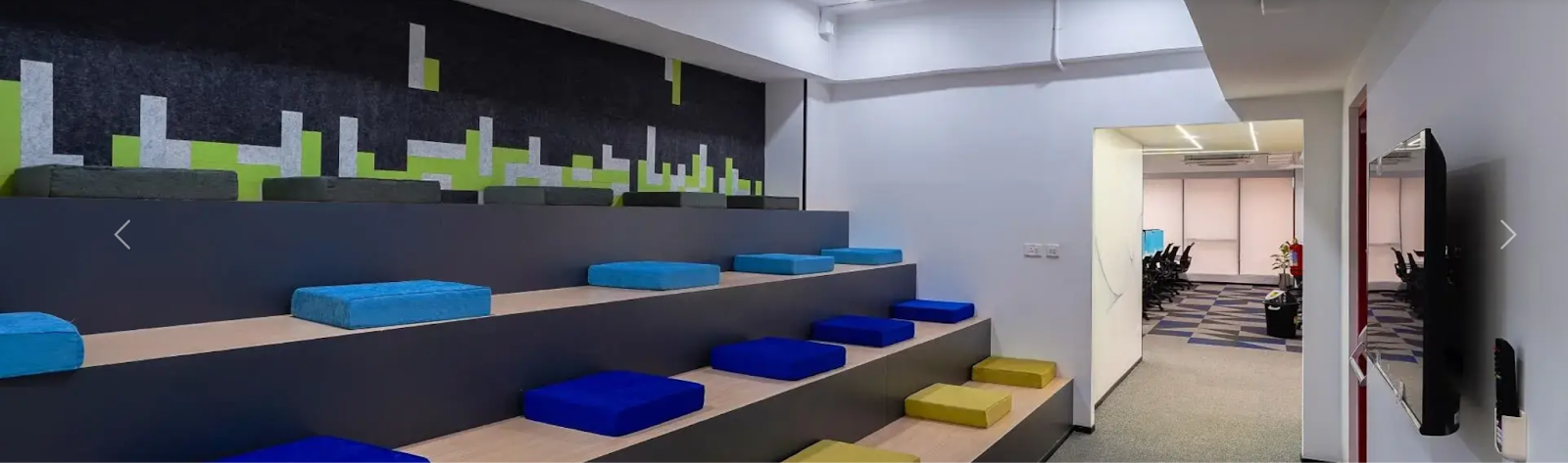
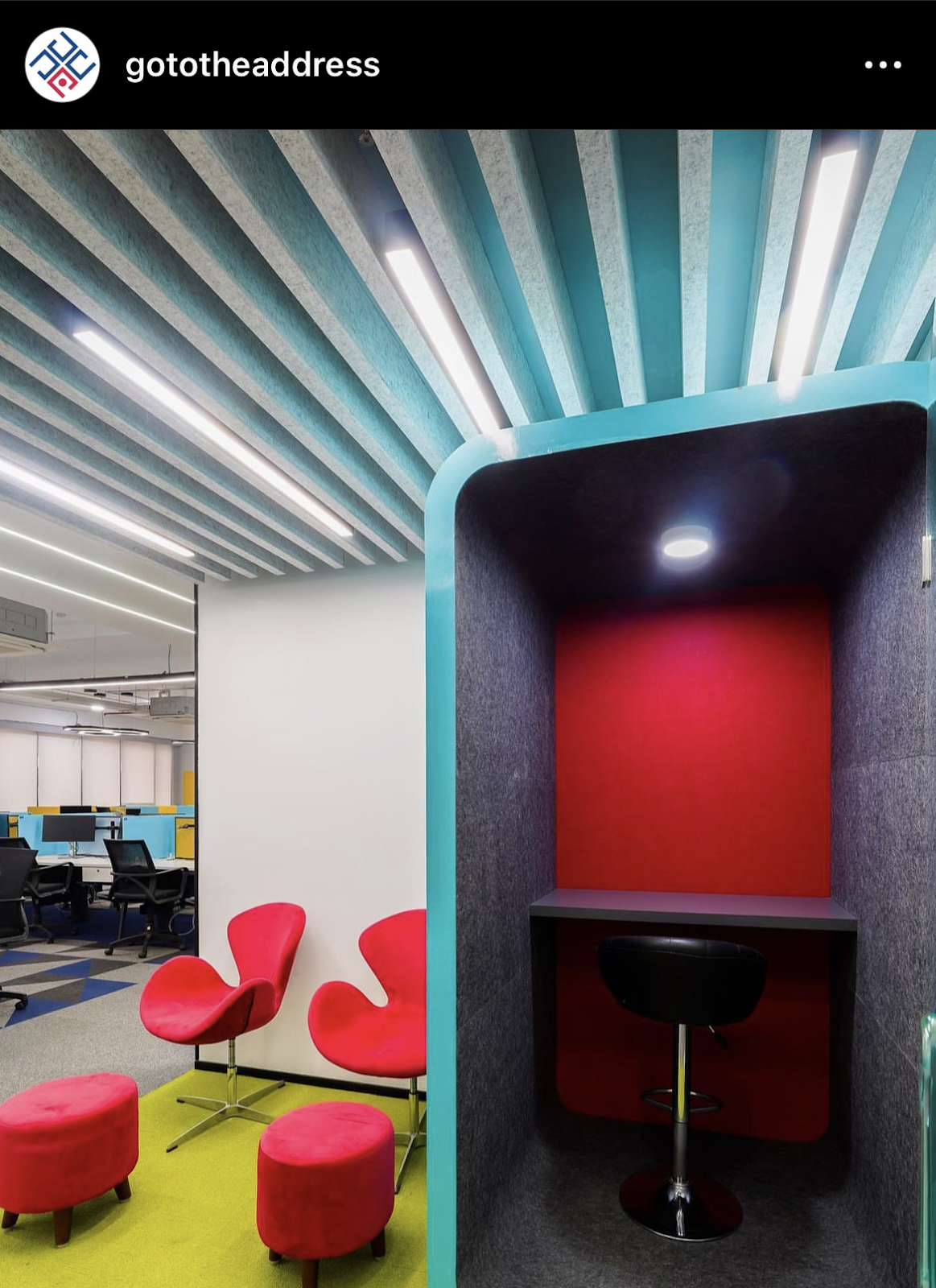
Impact: Ignite Creativity and Energy
How: Reds bring the heat. They, as long as used sparingly, stimulate the mind, foster creativity, and inject a burst of energy. But using too much of it can be overwhelming, causing stress and anxiety.
Perfect For: Creative hubs, brainstorming areas where ideas need to flow, or detail-oriented tasks.
Our Tip: Red is best in smaller amounts or paired with another color, like blue, for a balanced and visually pleasing environment that boosts productivity.
Impact: Cultivate Cleanliness and Openness
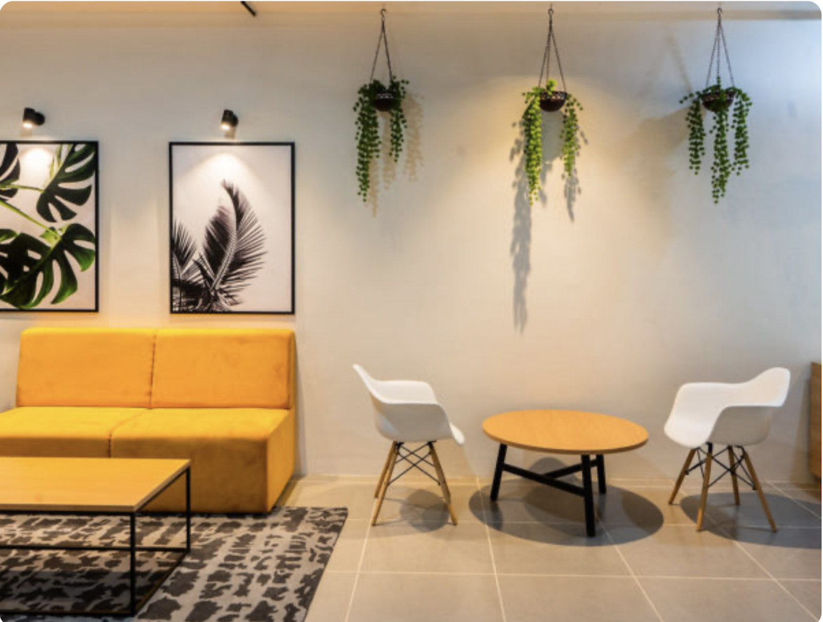
How: Whites and neutrals create a clean canvas. They open up spaces, make them feel larger, and evoke a sense of simplicity.
Perfect For: Creating a minimalistic office or welcoming and clutter-free environment in common areas.
Our Tip: Use white in combination with other colors to make it more interesting.
Impact: Promote Relaxation and Balance
How: Greens bring nature indoors. They have a calming effect, reduce anxiety, and create a sense of balance.
Green is great for reducing eye fatigue. It helps in long-term focus and benefits those who work extended hours or experience screen-induced eye strain.
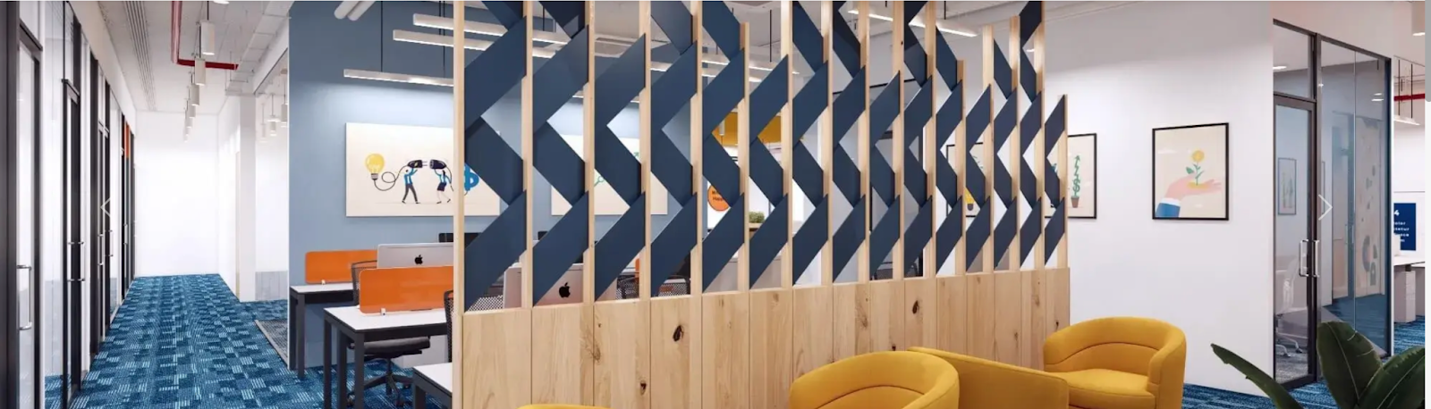
Perfect For: Break areas, collaborative spaces, meeting rooms or quiet corners.
Our Tip: Pair green with neutral colors like white, gray, or beige for a well-balanced look. Use green in custom furniture, like chairs or accent pieces, to add pops of color. Or Incorporate green through indoor plants.
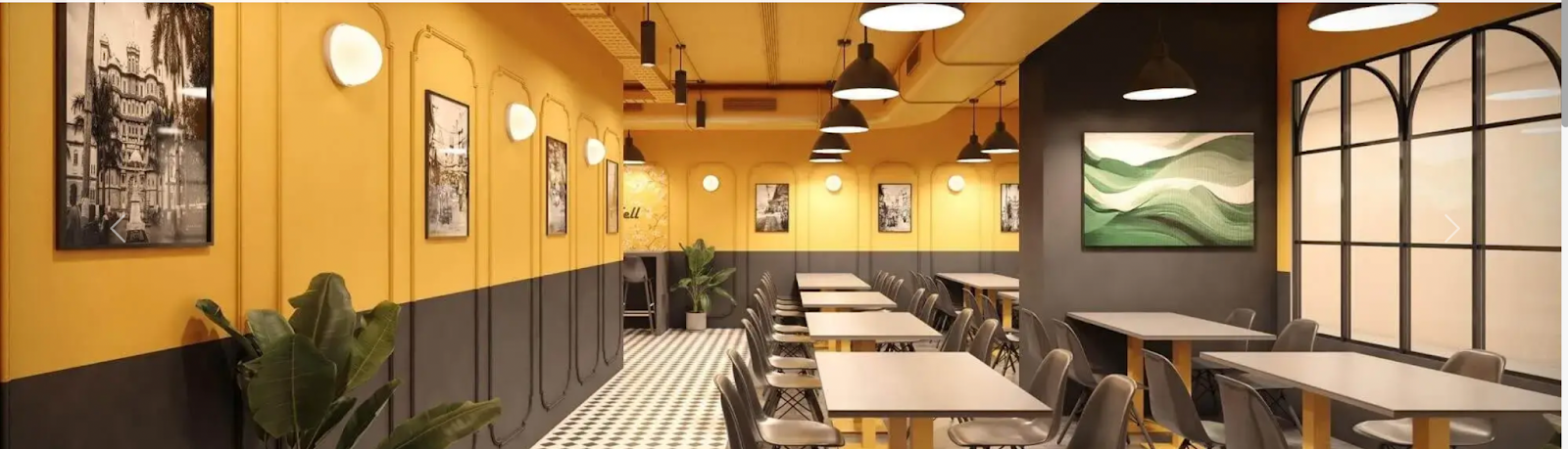
Impact: Foster Warmth and Creativity
How: Yellows evoke warmth and positivity and can brighten up any space. Also seen as an optimistic color, known to inspire higher levels of creativity and innovation.
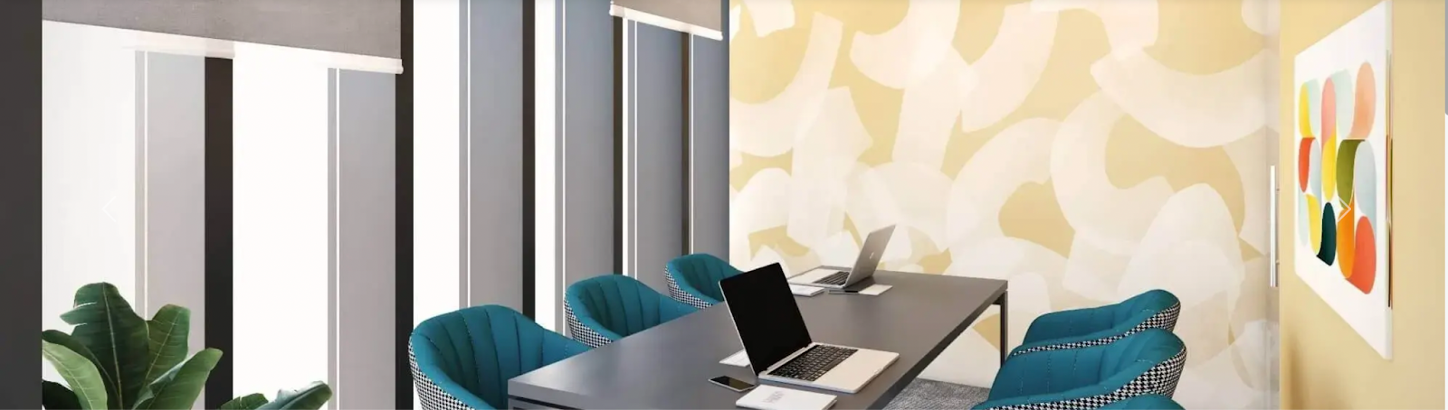
Perfect For: Common areas, meeting rooms, reception areas or any place where a cheerful atmosphere is key.
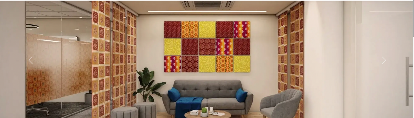
Our Tip: Avoid covering large surfaces, such as entire walls, in bright yellow. Instead, use it in moderation on smaller elements like furniture, artwork, or accessories. Ensure that the lighting in yellow-infused areas is well-distributed and not too harsh.
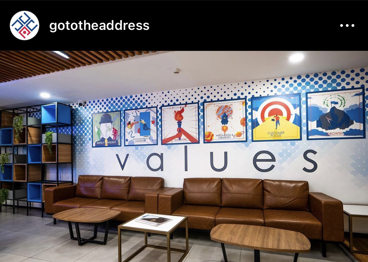
Impact: Convey a sense of dependability and professionalism.
How: Brown is a classic and timeless color, often linked with professionalism. It can create an environment that is serious and grounded. In an office, it can bring a touch of the outdoors, fostering a connection with natural elements.

Perfect For: Lending an air of authority to executive offices and conference rooms.
Our Tip: Use a warm shade of brown as a backdrop for more vibrant colors and tone down the overall palette.
Impact: Add a Touch of Luxury
How: Purples inspire a sense of luxury. This makes employees feel sophisticated, motivating them as if they are representing a prestigious brand or company.
Perfect For: Spaces where a touch of elegance is desired, like executive offices or collaborative lounges.
Our Tip: Introduce purple through furniture pieces like chairs or sofas. Use it in accessories like throw pillows, rugs, or desk decor. These smaller elements can be easily swapped or updated to refresh the design.
Impact: Evoke Professionalism and Formality
How: Grays provide an excellent contrast to vibrant colors. It can temper a busy, multicolored scheme. However, excessive use of gray may feel oppressive, so finding the right balance is key.
Perfect For: Offices, meeting rooms, or places where a professional setting is crucial.
Our Tip: Explore gray flooring options like carpets or tiles to establish a cohesive and contemporary aesthetic. Or introduce textured gray elements, such as textured walls or patterned fabrics, to add depth to the office design.
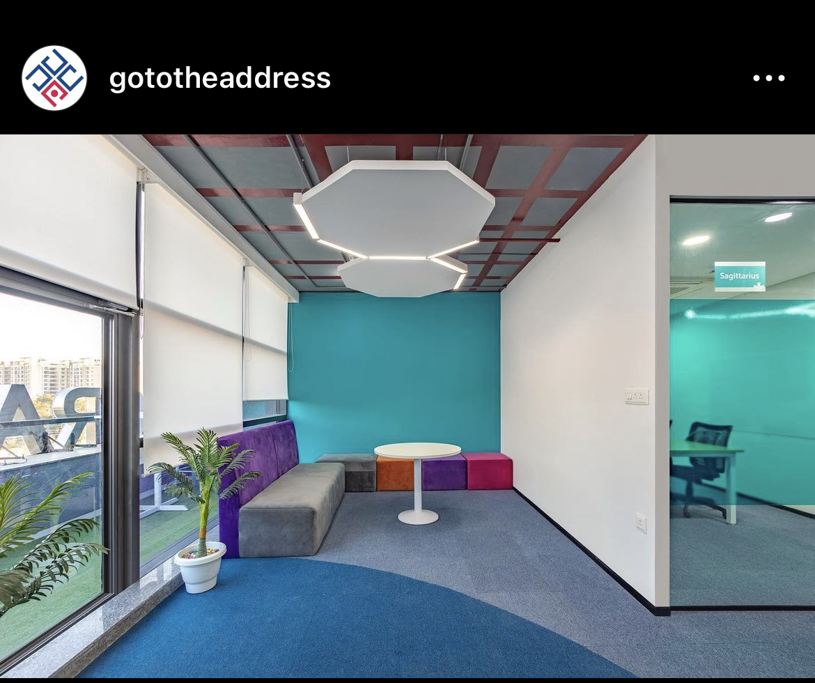
As employees move around more and spend less time at their desks, having workspaces tailored to different work modes is key for boosting productivity.
The Spaces suggests taking advantage of the different emotions each color brings to the table to create distinct zones in your workplace. The trick is to use color to divide your office spaces. Go for lively, bold colors in areas where creativity and socializing thrive, and opt for softer, muted tones in spots designed for focused work.
Remember, the modern workplace is all about flexibility, so let the color palette adapt to that dynamic vibe.
Keen to explore more about color psychology and how The Address weave it into our designs? Give us a shout! We’d love to chat with you!
What are the best locations for Coworking Space In India
(Featured Image – Pexels)